Jim Beam: Spirit of the Porch
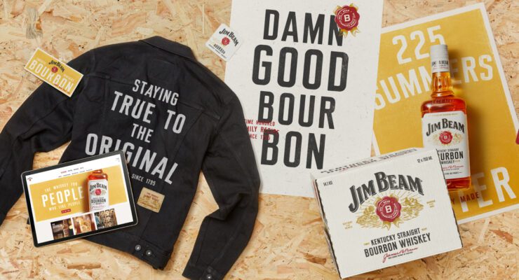
Jim Beam, the world’s number one bourbon whiskey with a story almost as old as Kentucky, faced challenges of stand out due to generic category norms. To serve all the needs of a modern brand, we set about putting the soul back by recrafting and simplifying the brandmark, emphasizing tradition and returning the iconic white bottle to its roots.
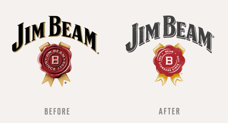
The redesigned visual identity introduces warmth in a traditionally dark category with a sun gold colour and woodblock print. The unpolished, easy-going aesthetic reflects a brand that likes to see people come together and appeal to a new generation of whiskey drinkers. Like the Whisky, the toolkit is made with a select handful of ingredients, those that make Jim Beam like no other. New to the family is ‘Kentucky Straight’, a bespoke font distilling centuries of previous Beam labels and typographic traditions into one brand typeface.
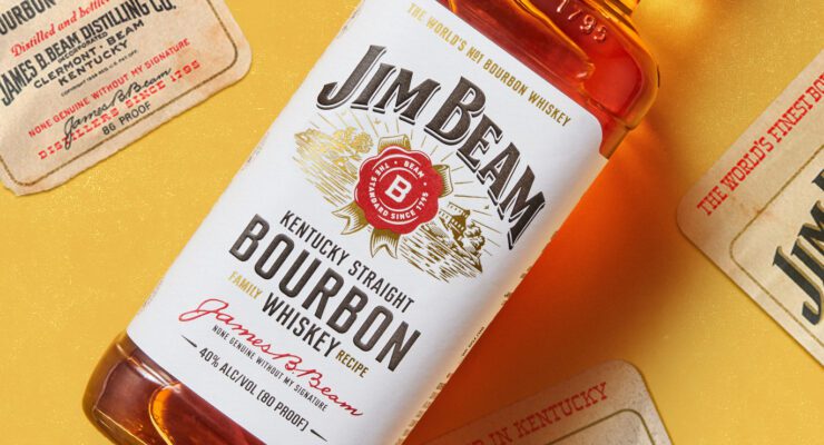
Woodcut illustrations, a long standing feature, enhance authenticity, making the iconic bottle a visual icon adaptable to various environments. Jim Beam’s new identity stands as a testament to its genuine spirit and craftsmanship, inviting all to savour its history and share in its legacy.
CLIENT
Jim Beam
CAPABILITY
AGENCY
Turner Duckworth Find out moreTurner Duckworth
Our principle is simple: Love the unmistakable. We craft brand assets that mean even a glimpse of marketing or packaging cannot be anything but the brand. Cutting through the noise and placing the brand top-of-mind, our work is simple, emotional and highly distinctive. The majority of our clients are global so our influence extends beyond our immediate studio territories to three studios, in three creative cities, seamlessly connected, working together as one company.