
Smythson- Treasure the Days
Smythson has long been a keeper and organiser of days. But for all its sense of order, the brand itself lacked an organising idea. So we turned to where the Smythson story begins: the diary – and built a refined identity system to express it.
A word rooted in diarum (‘to shine’) and dies (‘day’), the diary is – in essence – an object of days kept and pages treasured. A meaning that shines even brighter in light of Smythson’s silversmith founder, Frank Smythson.
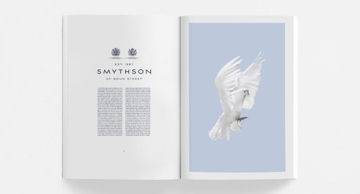
The wordmark was re-cut for balance and composure, joined by two typefaces – a copperplate titling face that echo’s engraving tradition, and a literary serif worthy of fine book printing.

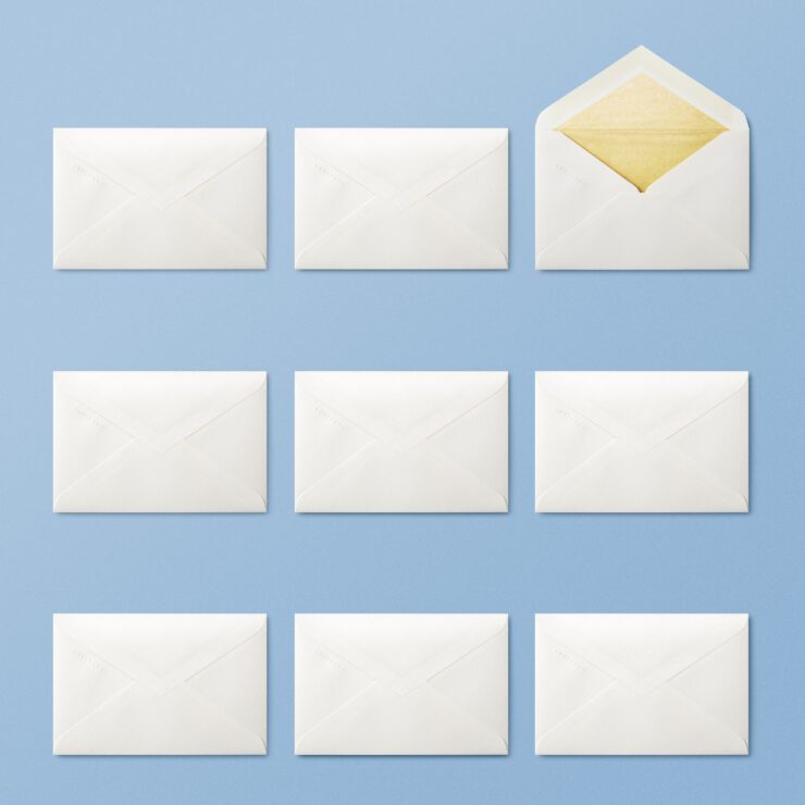
Across every touchpoint, Smythson Blue – a colour of thought, imagination and clarity – was elevated to halo status. Whilst exquisitely arranged compositions capture a lightness of spirit; the quiet pleasure of arranging and keeping.
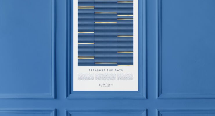
An identity that re-inks Smythson’s sense of purpose – a brand that not only organises days, but offers more beautiful ways to treasure them.

CLIENT
Smythson
CAPABILITY
AGENCY
Turner Duckworth Find out moreTurner Duckworth
Our principle is simple: Love the unmistakable. We craft brand assets that mean even a glimpse of marketing or packaging cannot be anything but the brand. Cutting through the noise and placing the brand top-of-mind, our work is simple, emotional and highly distinctive. The majority of our clients are global so our influence extends beyond our immediate studio territories to three studios, in three creative cities, seamlessly connected, working together as one company.