
Icelandic Provisions: Conquering the food aisle
Few categories move faster than yoghurt. To win here, brands need to stand for more than creaminess. Fortunately, Icelandic Provisions had something deeper – the story of Skyr, a thousand-year old saga stretching back to the Vikings. The challenge: how to bring their authentic story to life.
We began with a new mark: the Viking longship – a distinctively Icelandic symbol of strength and journeying. The word “Provisions” sits in the hull, where the provisions would be, while the two Os become shields hung from the sides.
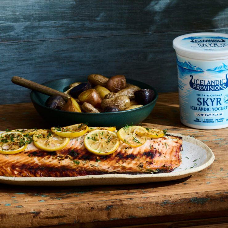
With such an unmistakable mark in place, the packs could embrace colour. The optimistic, flavour-led system – drawn from the hues of Iceland’s brightly painted homes – breaks the cold white that defines the rest of the category.
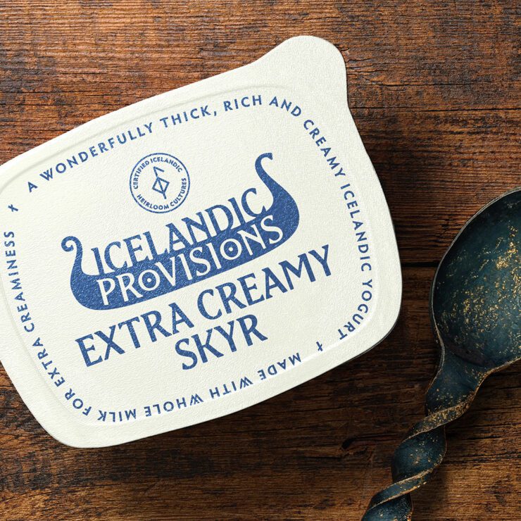

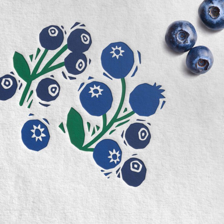
A bespoke typeface, “Edda” – inspired by traditional Icelandic runes – and a hand-carved illustration style further anchors the brand in its unique heritage.
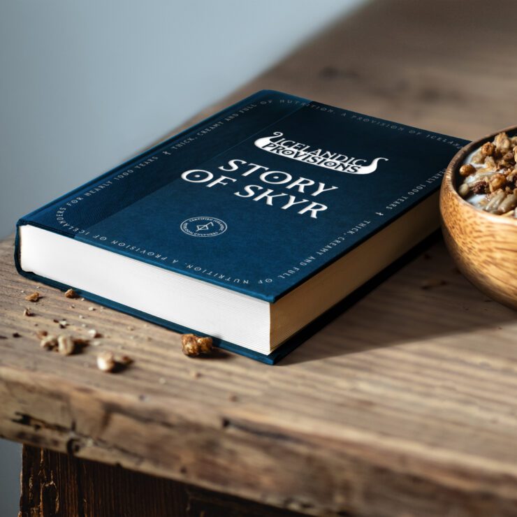
We want people to really feel the authenticity of our product. Skyr is made with genuine heirloom cultures that stretch back to the age of the vikings – it’s a fantastic story” – Dan Hickle — Icelandic Provisions, Chief Marketing Officer
CLIENT
Icelandic Provisions
CAPABILITY
AGENCY
Turner Duckworth Find out moreTurner Duckworth
Our principle is simple: Love the unmistakable. We craft brand assets that mean even a glimpse of marketing or packaging cannot be anything but the brand. Cutting through the noise and placing the brand top-of-mind, our work is simple, emotional and highly distinctive. The majority of our clients are global so our influence extends beyond our immediate studio territories to three studios, in three creative cities, seamlessly connected, working together as one company.